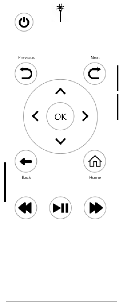
As soon as I got this assignment, I knew it was a golden opportunity to address some of the downfalls of some modern remotes. Using my TV remote as a starting point, the most important thing I wanted to address was the exorbitant amount of pressure needed to 'click' the buttons. Even with new batteries, the softness of the buttons and lack of tactile feedback made me squeeze the remote so hard the plastic started to creak whenever I tried to operate it. I opted for firmer, more tactile buttons such as those on a computer mouse, but with a rubberized surface.
Next, I wanted to keep the controller as simple as I could, with the added bonus of having a 'point-and-click' option. To create this affordance, the proprietary remote would have an infrared (IR) sensor at the top and a button along the left side. Clicking the button would enable the IR sensor and disable the directional buttons; clicking again would disable the IR and enable the directional buttons. The user would simply need to point and click the OK button to select an item.
As for the button interface, I tried to keep it as self-explanatory as possible. The Previous and Next buttons would be used to quickly page through shows while browsing or skip to the previous and next chapters or episodes during playback. The Home button could be pressed at any time and the user would be brought to the browsing screen. The Back button would take the user to previous screen; during video playback this would stop the video and return the user to the details of the show. The buttons on the right side of the remote were to control the volume.
After creating the first iteration of the remote, I shared it with my team in order to get feedback on what could be improved. There were 3 items in particular:
My team told me they would, "like to see skip to the next scene buttons, and a stop button." They continued on to say they were unsure if the Previous and Next buttons would be used for this functionality, and they felt these buttons were for screen navigation instead of playback controls.
There should be voice controls for added accessibility.
If Volume Up and Volume Down buttons exist, there should also be a Mute button.
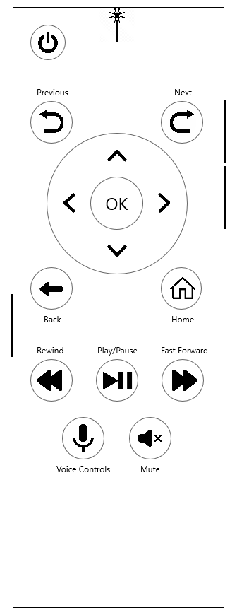
With a quick back and forth, we decided even though the Previous and Next buttons feel like they are primarily for screen navigation, the labeling of Previous and Next, in conjunction with a prompt on the screen would suffice because, "It's super easy to keep adding more functionality intending to help a user, but it just ends up confusing them."
In the second iteration, a button for voice controls was added and a built in microphone would be placed somewhere on the controller. This would allow the user to speak in a normal speaking voice instead of feeling as if they need to shout across the room to successfully use the voice commands.
The size of the side buttons, particularly the volume controls, was also increased to be more accessible and a mute button was also added. For the sake of accessibility, all of the buttons (except the power button) were moved up on the controller. It is very likely the user will either use their thumb or index finger while holding the remote so buttons lower on the interface would be more difficult to operate.
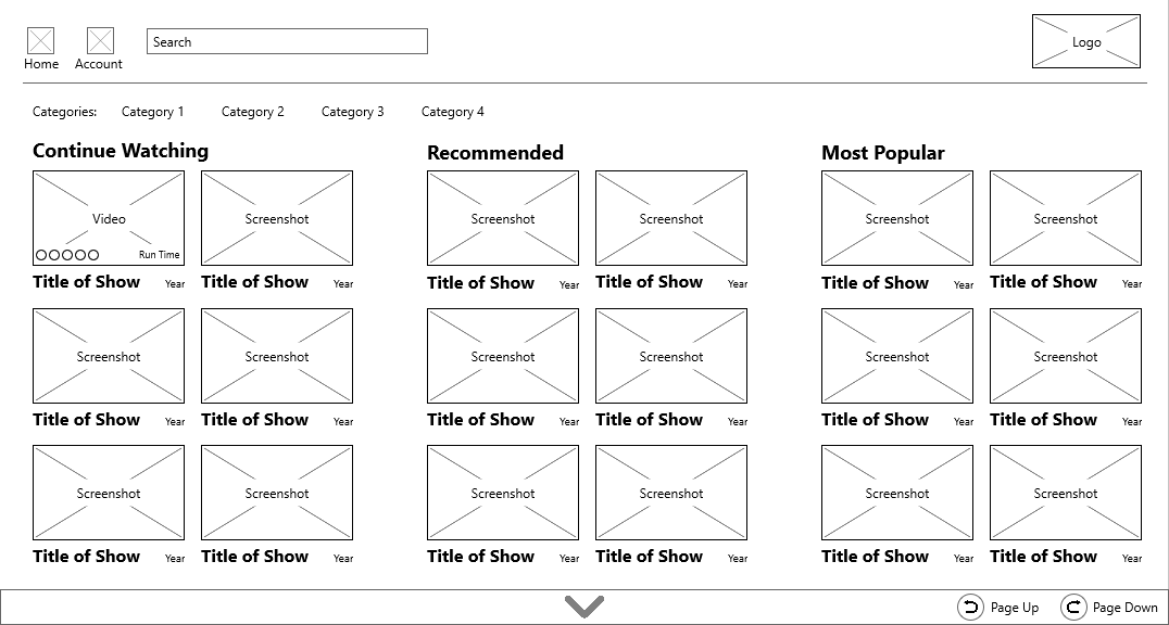
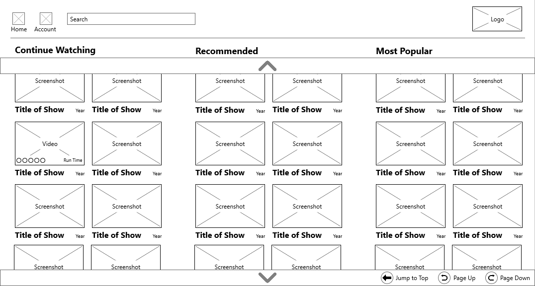
After tackling the basics of the controller, I moved my focus towards the grid viewport. My primary device for streaming was (and still is) a gaming console. The biggest gripe I had with these layouts is the single row in each category. By creating a two column categorical grid, I could almost halve the number of clicks the user would need while scrolling and I could increase the number of visible shows in each category. One aspect of the typical design on gaming consoles I found useful and mimicked was the header navigation being weighted towards the left side. Generally, the default selected video is the top left so it reduces the number of clicks the user needs to access the header navigation.
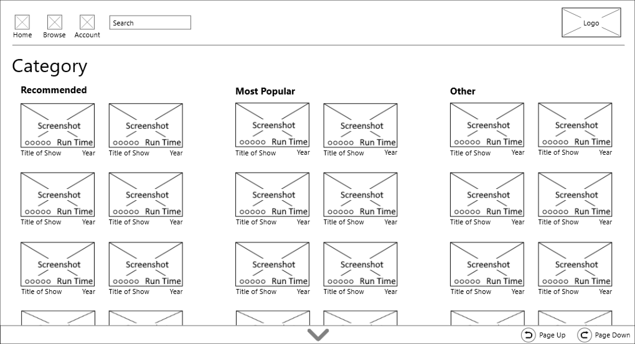
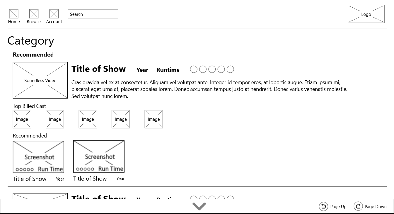
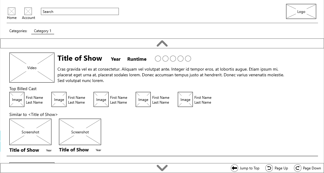
Along the bottom of the screen, the downward arrow would only show if the user was in "point-and-click" mode and would act like the Page Down button on a keyboard. An upward facing arrow would appear if the user was further down the view. The Page Up and Page Down buttons would only appear if the user was in button mode and would act the same as clicking the downward arrow in the "point-and-click interface". The "Rating and Run Time" would not show until the video is highlighted. Just like with the controller, this wireframe was submitted to my group for feedback. There were two glaring issues with the first iteration.
The weight of each element felt off. The title of the video is the most important text aspect, but it was the same font size as the year
The elements of the interface all felt small, especially if a laser pointer interface was going to be used.
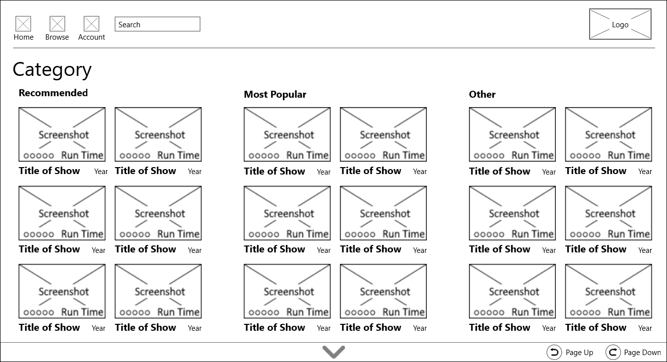
Taking the feedback, I increased the size of the screenshot images. I also increased the text size of the show title and made it bold to draw the users' eyes to allow for faster scanning of the page. There was still plenty of whitespace between the categories to keep them from meshing together. Again, the Rating and Run Time would not be displayed unless the video was highlighted.
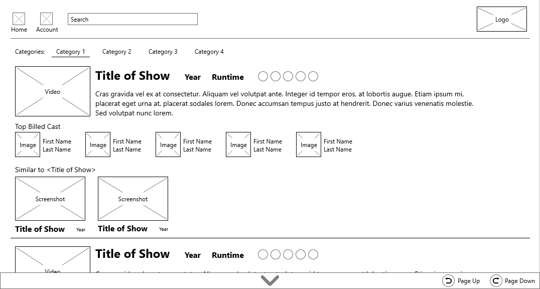
The third requirement for this project was a single-column list view to navigate through shows and movies. After having a decent foundation with the controller and grid view, this viewport fell together nicely.
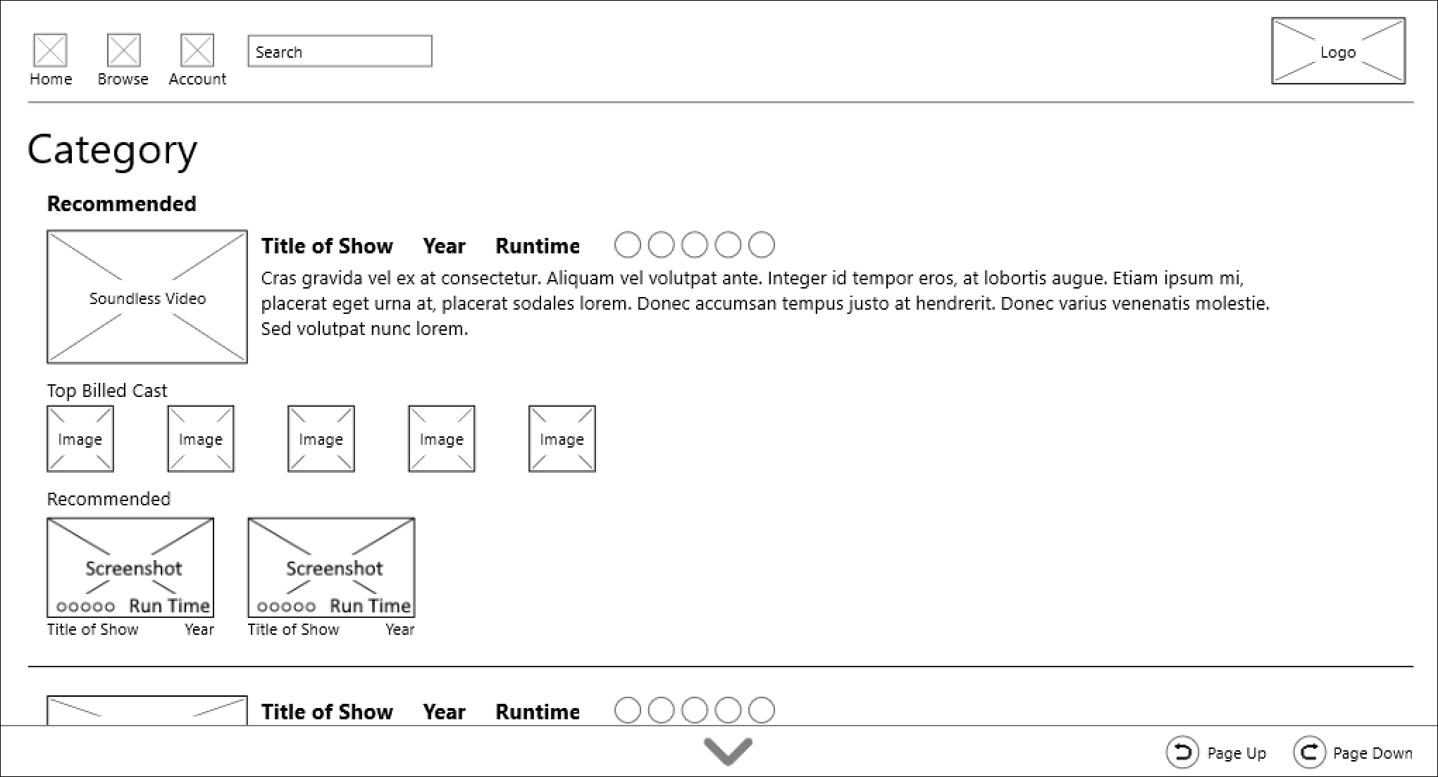
I started by noting what details I thought the user would expect to see. The lorem ipsum text would be the synopsis of the movie or description of the show's episode. Next, I chose to display the Top Billed Cast because some users will not watch shows with certain cast members. I also imagined a preview would be nice; the screenshot from the grid view would turn into either the trailer for the movie or a snippet of the current episode soundlessly. I chose to keep the video muted to not be distracting or be a nuisance to the user.
This wireframe was submitted to my group for feedback at the same time as the controller and grid view, therefore the issues with the first iteration were the same for both the grid and list interface.
The weight of each element felt off. The title of the video is the most important text aspect, and it was the same font size as the year and runtime.
The elements of the interface all felt small, especially if a laser pointer interface was going to be used.
Considering the feedback was the same, my approach was the same as well. Simply increasing the size of the thumbnails and increasing the font size of Title of Show allowed me to provide appropriate weighting to these elements.
After touching up the designs, I created a prototype using InVision App. The link is here: InVision Prototype. I am not entirely happy with the way the prototype is layed out. The first set of arrows (the ones not on the remote interface) are used to "control" the point-and-click interface. Unfortunately, the user needs to scroll down to use the remote, making the display difficult to see.
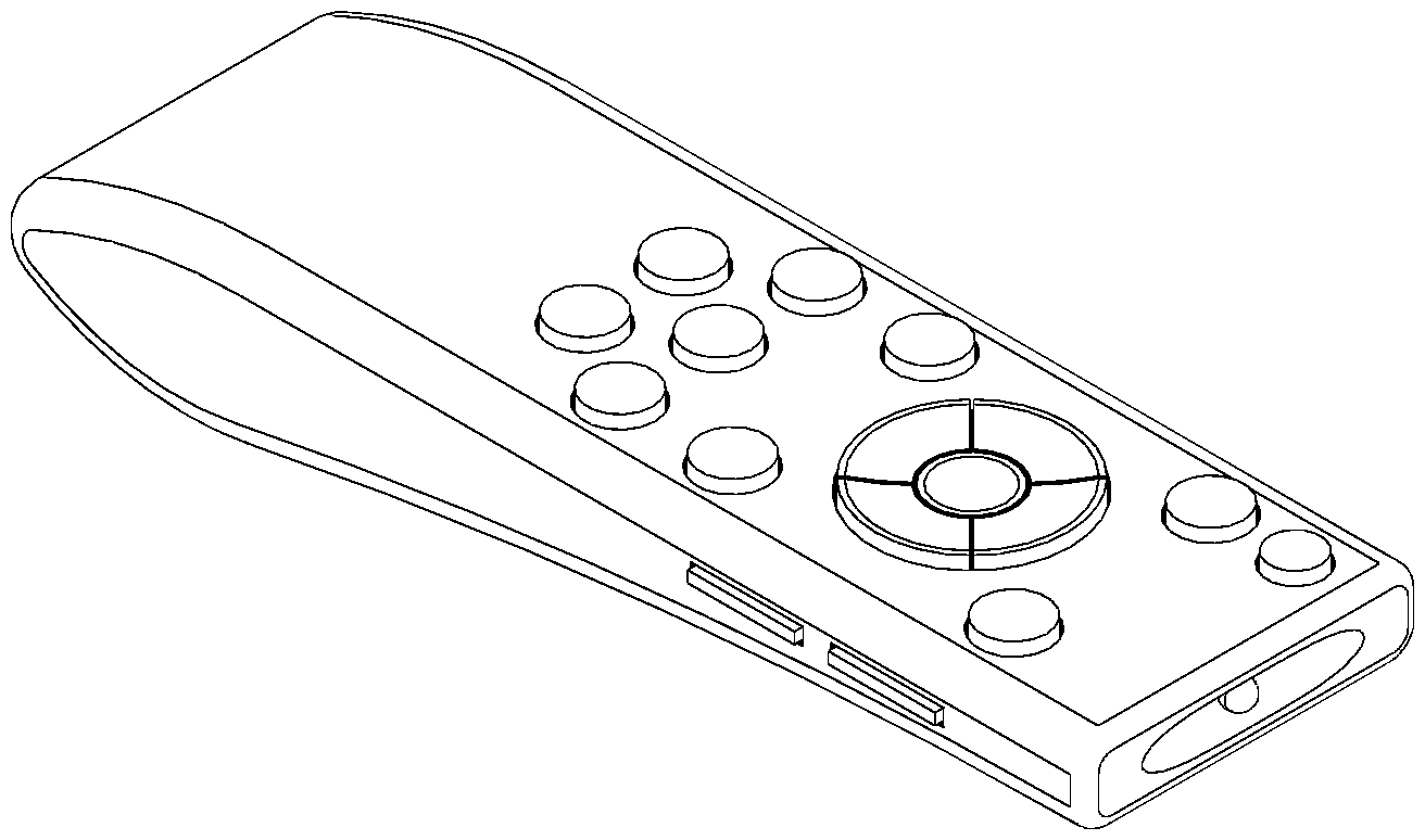
I am proud of the remote design. Even years after my initial designs, I felt the foundation for it was solid, but I wanted a 3-Dimensional view of it to further understand the size and ergonomics of my design. I am happy with the way it looks and am currently in the process of printing the prototype to have a physical representation of the ergonomics. It is difficult to see in the image, but the main navigation buttons and OK buttons are bowl-shaped so the user can always find the OK button in the center.
Looking back a the grid and list views, I decided a slight rework was necessary for my own sanity. First, I couldn't come up with a good answer for what the Browse button in the header did, so I removed it. The homepage is the browse page, so it was an unnecessary redundancy. Next, I wondered what the large "Category" header added to the view and how I expected the users to view other categories of videos. By extension, I couldn't believe I forgot to make "Continue Watching" the first category, so I removed the unnecessary header and added navigation to the other categories. After that, I wondered what the pages actually looked liked when scrolled down. For the sake of usability, I added a shortcut to the top of the page using the back button because the user cannot go any further back from the home page.
The value of getting team feedback is unmeasurable. As a designer, you can assume all you want, but you need to remember you wouldn't be the only user of what you're designing. This was also the course where it was firmly planted in my brain that UX spans across everything. From Mobile Apps to TV screens to door handles to city intersections. A "user" is so much more than the person who interacts with a app or screen; anybody who interacts with anything is a user.
If you like what you see and want to work together, get in touch!
tckleindl@gmail.com