As part of the requirements for my Information Architecture II course, I was assigned to choose from a list of small-town library websites to perform an analysis of the website's information architecture. This assignment started with a made up email from the director of the Taylor Community Library of Taylor, Michigan which stated:
We are in dire need of having our website redesigned from the ground up with emphasis on easy to access information and welcoming thematic elements. Our current website look is quite dated from a technological perspective, and while there is an abundance of information, it can be daunting for our users to FIND that information (i.e. it could be organized much better).
We’d like to take the content that is on the current site and have it reworked so that it is easy for our patrons to find exactly what it is they are looking for, be it the online catalog, information about preschool story times or downloading a meeting room application form.
As we are a small-town library with a small staff and not a lot of funding, this just isn’t something we’re able to do in-house. Thank you in advance for your time in assisting us with this.
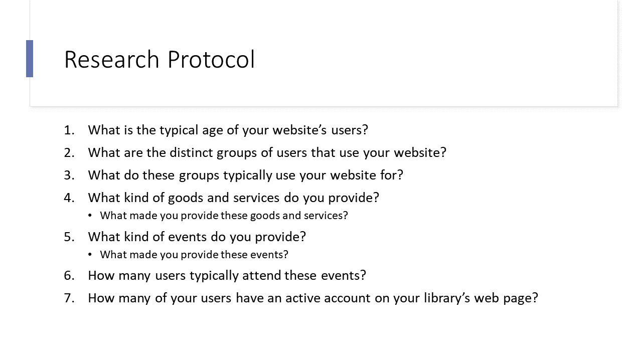
I contacted the Hennepin County Library (Minnesota), the Washington County Library (Minnesota), and the Taylor County Library (Michigan) requesting their response to a questionnaire I developed to gather more information of their website users and library patrons. The questionnaire consisted of the following:
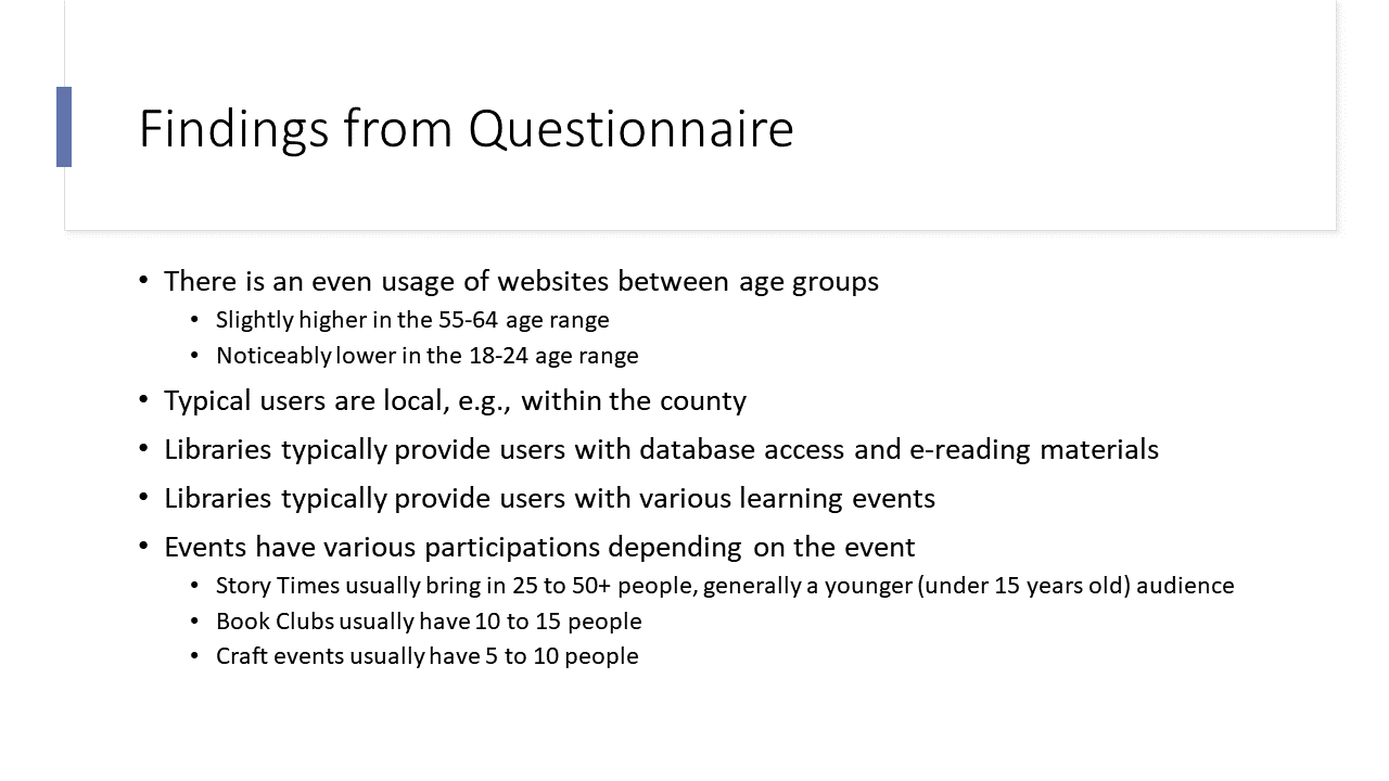
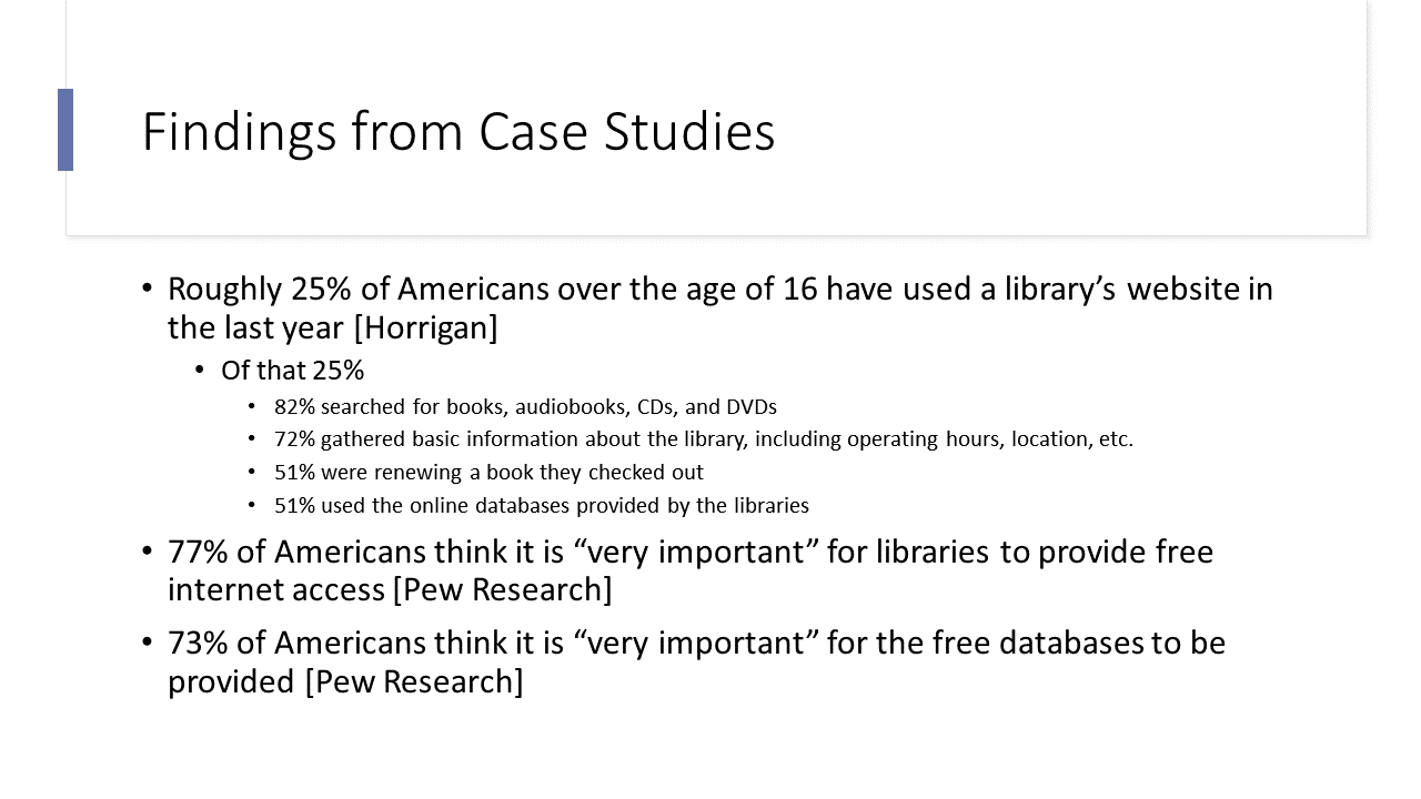
While I awaited their feedback, I gathered information on the average library patron using two case studies from Pew Research: Libraries at the Crossroads and Library Services in the Digital Age. Using my questionnaire and the case studies, I was able to extrapolate the following data:
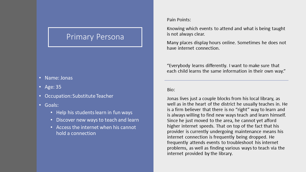
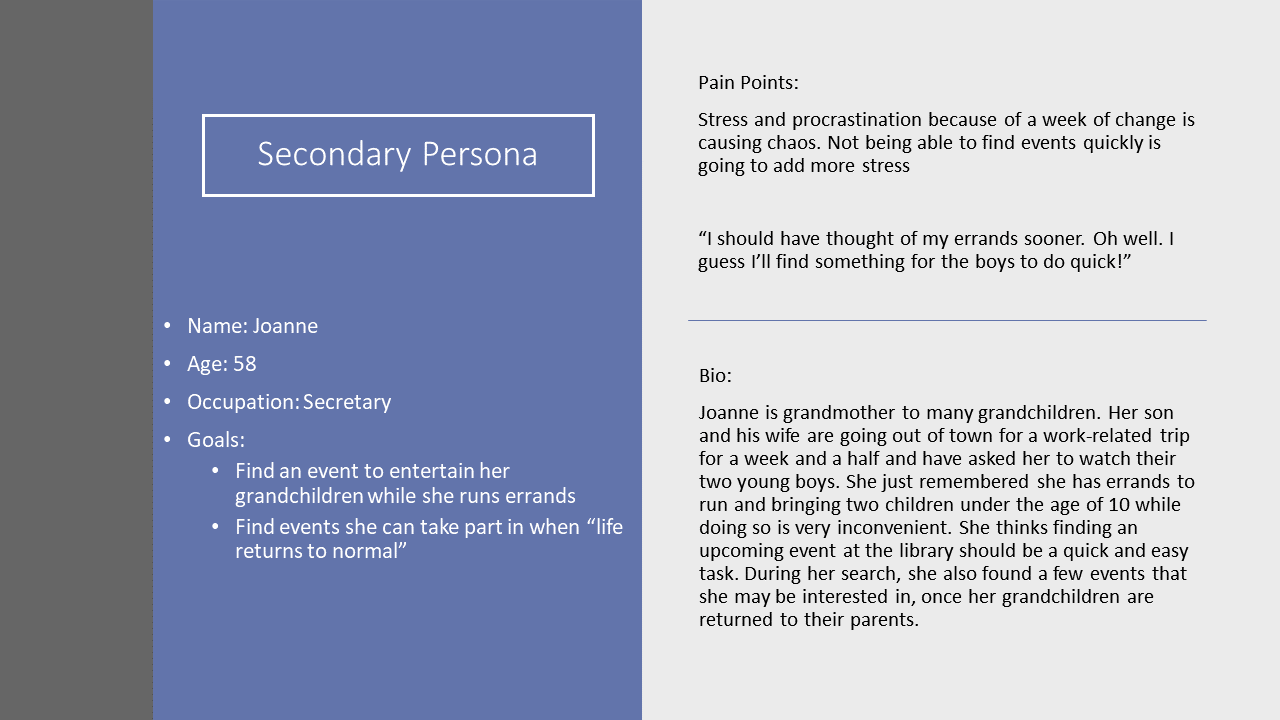
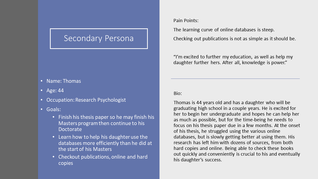
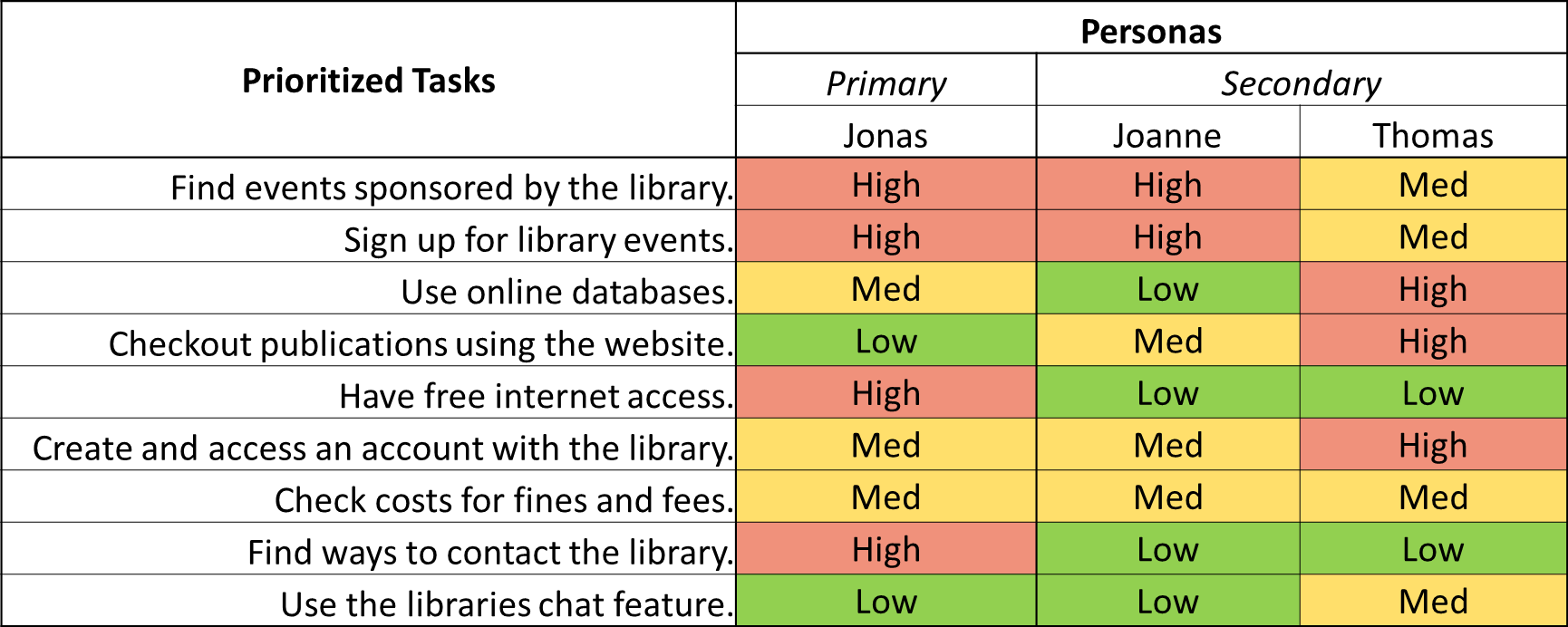
Using the data I gathered from the questionnaire and the case study review, I was able to create 3 personas (1 primary and 2 secondary personas). Once the personas were in place, I was also able to create a Persona Task Prioritization Table to further understand where users would expect to complete their tasks.
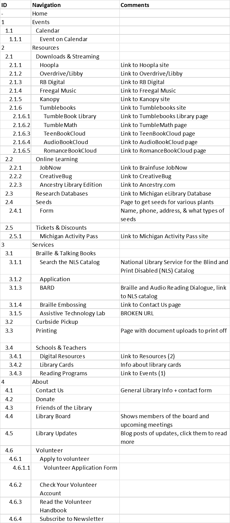
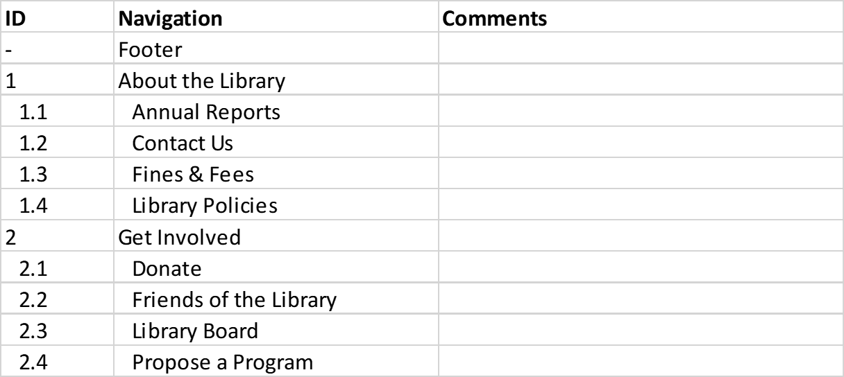
After creating personas, the next steps were to perform a content analysis, create a site map, and perform a Treejack analysis. First, I extracted the labeling and taxonomy of the header and footer separately so it would not appear the "About the Library" and "Get Involved" were a part of the header. To do this, I clicked through the webpage and created a spreadsheet which can be seen below:
After creating the content analysis spreadsheet, I created the Treejack study, which conveniently allowed me to import the Excel spreadsheet. The most important step was to find users willing to test the architecture. Thankfully, I had a handful of users who provided their contact information in the past who were always willing to lend a hand. After importing the taxonomy spreadsheet to create my "tree," I created tasks for my users to complete based on the high priority items in my task prioritization table and determine where in the architecture the task could be completed. As an example, completing the task, "Find events put on by the library" would be completed by following the path: Events -> Calendar -> an event on the calendar. After setting up the tasks, I sent an invite to the users and Treejack collected all the data I needed. I transformed the data Treejack provided me into the table below.
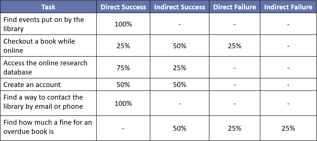
Optimal Workshop defines a direct success as "the user navigated correctly without any back tracking," whereas an indirect success means "the user navigated correctly, but had to back track to get to the successful outcome." A direct failure means "the user navigated incorrectly and did not back track," and an indirect failure means "the user navigated incorrectly with some back tracking."
Using the results from Treejack, I was able to make the following changes to the labeling and taxonomy.
Rename "Resources" to "Reading and Research"
Rename "Services" to "Library Resources"
"Fines and Fees" will be added to "Contact Us" in both the header and the footer. Note: There will also be an option to view "My Fines and Fees" under "My Account"
Move "Get Involved" from the Footer to the Header
Rename "About" to "Contact Us"
Rename "Downloads and Streaming" (under "Resources") to "Third Party Resources" (under "Library Resources")
Move "Job Now", "Ancestry Library Edition", "Creative Bug" to "Third Party Resources"
Remove "Online Learning"
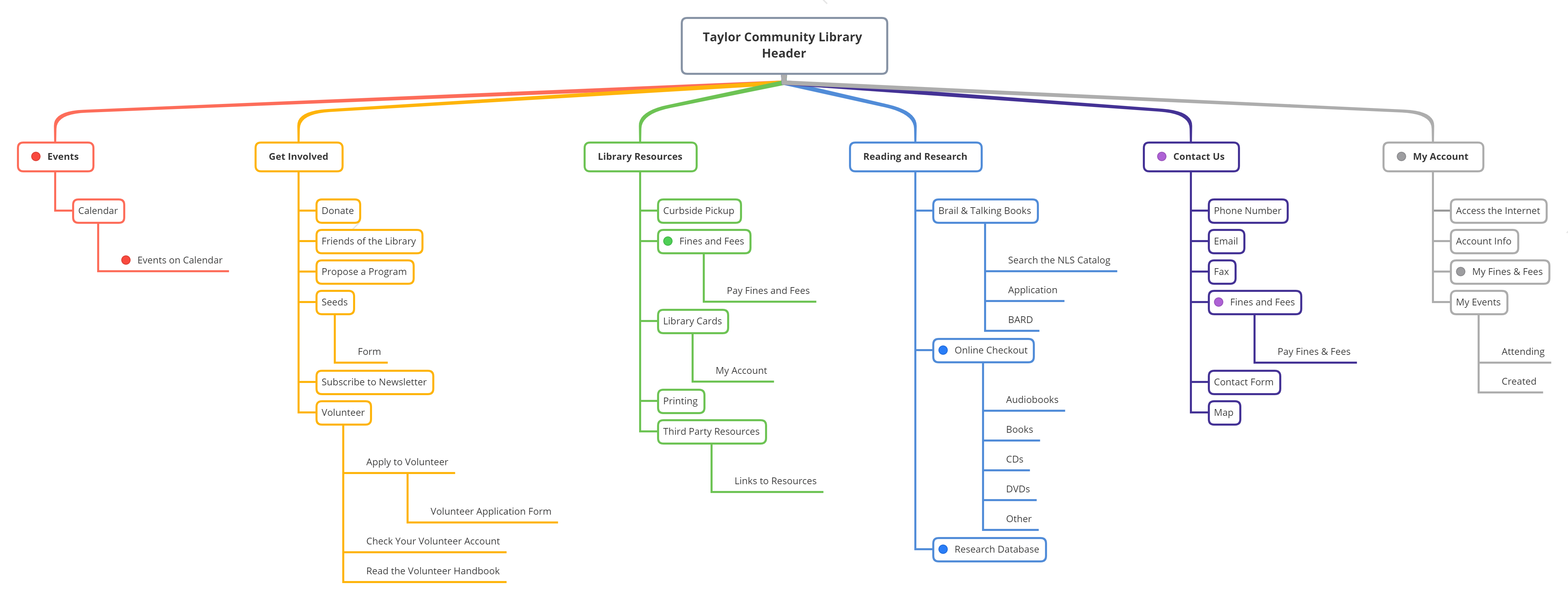
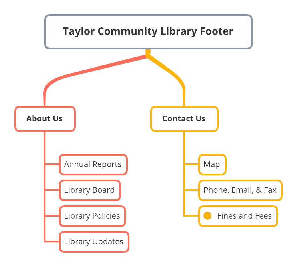
A visual display of these changes can be seen in the site maps below. The colored dots represent where users would access the high priority tasks
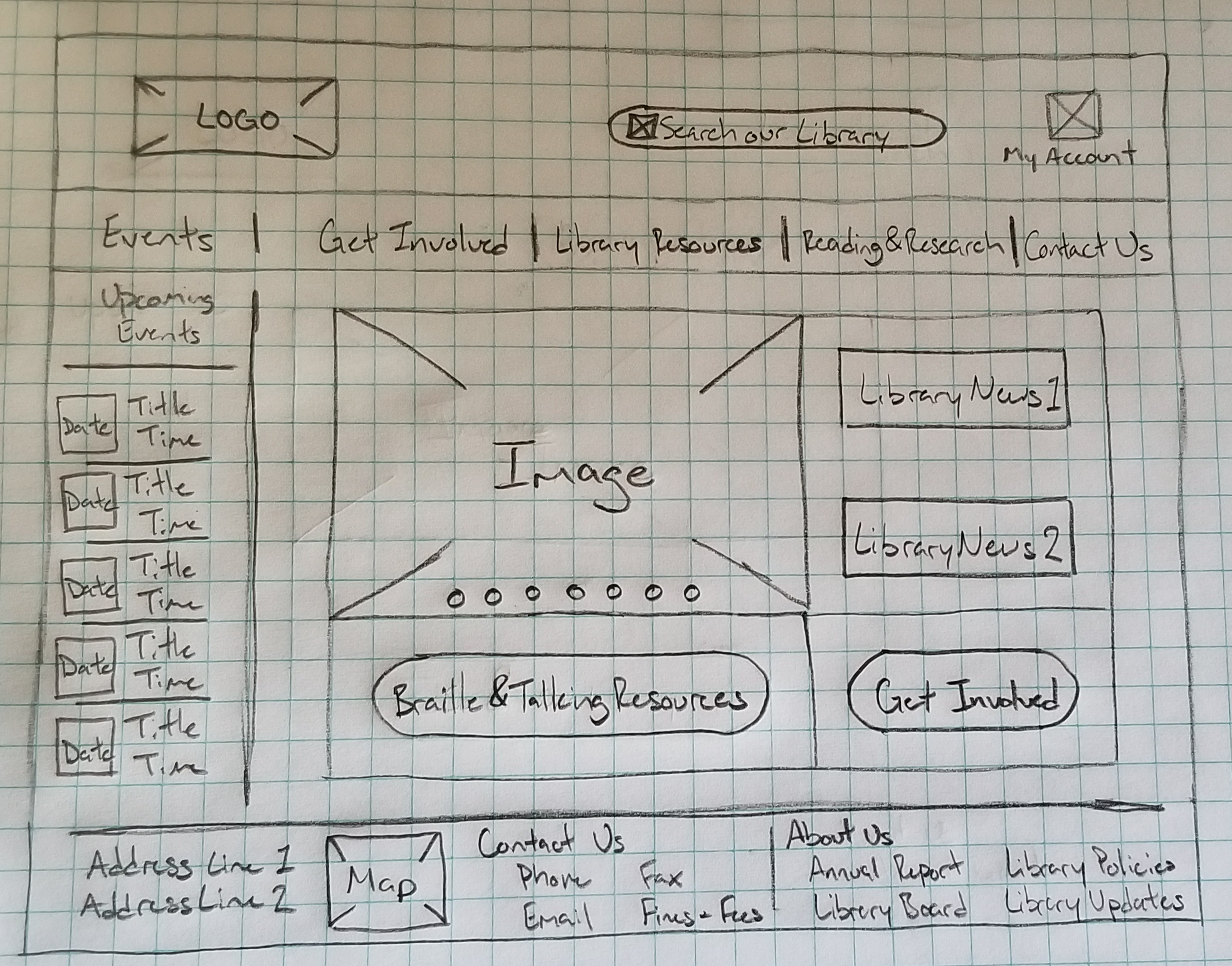
Once the labeling and taxonomy were solidified, I could start creating wireframes for first-click analysis using Chalkmark. Creating the first-click study involved uploading the wireframes, creating tasks for users to complete, and selecting the appropriate area for the task to be successfully completed. One thing I wish I would have known going in was to be more generous with the success areas. There were quite a few instances of Chalkmark saying the user failed a task, when in reality their click was slightly outside the success area. After going through and finding these instances, I created a table similar to the one made for the Tree testing. While I was going through the results of the study, I decided to label any clicks in the search bar as partial successes. The user would have successfully found the information they were looking for by using the search bar, even if it is not the optimal approach. I should also note in the 6th task, users that clicked my account were marked as partial success for clicking "My Account". The task was meant to find the standard rates for fines and fees, not the fines and fees owed by the specific user. However, with some basic math the user would be able to gain this information anyway.
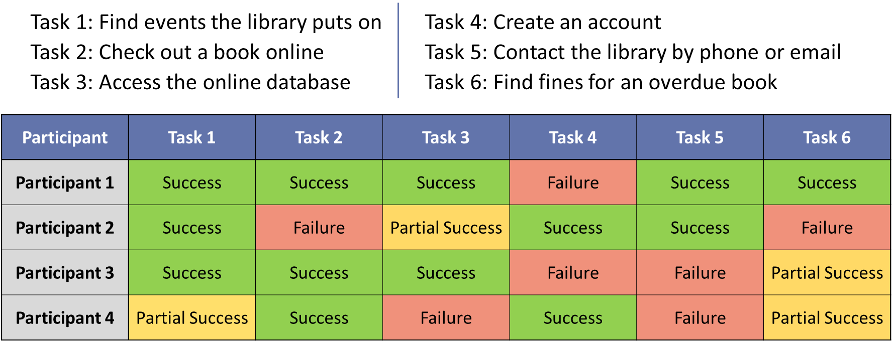
Although this assignment ended here, it was made clear by the table, the 4th, 5th, and 6th tasks were not easy to complete. To correct the 4th task, the "My Account" in the top right would say "Create Account/Log In" if the user was not logged in. The 5th task was much more difficult to correct. Many websites have their contact information in the footer, and I already had a "Contact Us" tab in the header. I believe the best solution would be to combine and/or reorganize the "Contact Us" and "About Us" in the footer. This solution would be the same for the 6th task, considering the users either used the search functionality or a different section of the footer.
As I progressed through this project, perhaps the most glaring shortcoming was not wording each task appropriately. Finding the balance of creating vague questions to avoid influencing the user and make detailed enough questions so users can start off on the right foot is something I am still working on.
If you like what you see and want to work together, get in touch!
tckleindl@gmail.com